Is your office a mess?
We are visual people. It’s built into our DNA. From the ability to judge danger in a natural habitat to feeling secure on a subway, our eyes and brains are built to constantly scan for input.
We also have the ability to listen and absorb more words than most people speak. If we’re native to the same language our speaker is using, our brains often also guess what the next word or phrase is going to be.
The point is that our brain gets bored and starts finding things to pick on. Namely your background.
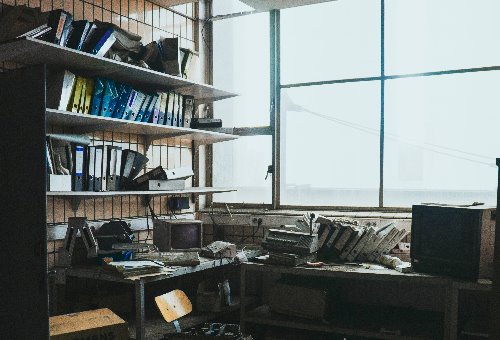
When you’re planning a webinar, one of the considerations (beyond your mic and camera) is the visual environment you’re presenting to the world! Grant Holmes, The Webinar Guy, talks about it in his podcast episode #17, “Managing your Visual Space.” While not the client space he mentions in the podcast, the image above is a representation of the challenge he talks about there. Two things that should jump out immediately are 1) messy shelves; 2) horrible lighting.
It is 2022, right?
Webinars, virtual summits, zoom meetings and such have been around quite a while, and by now, you’d think presenters would assume you can see behind them. Maybe its why they use that “Palm tree” (free) zoom background, but we highly advise against using digital imagery, especially where the software takes it out. Too many challenges with the shape recognition. Watching this can become a game where we’re watching to see how often the ears, or fingers of a presenter gets cut off. Oh yeah! Was there a presentation to concentrate on?
A Consciously Designed Set

Virtually any newscast, panel discussion, sports talk show, etc. has a set, and thousands of dollars have gone in to the BRAND being represented. Your budget may vary, but your thought process should be the same. “What is my brand?” and how do I best represent it, on screen?
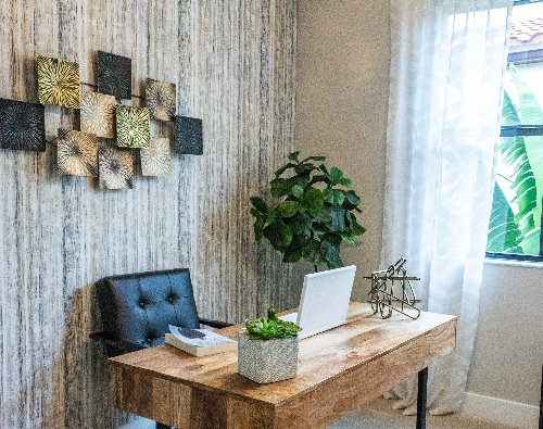
Take the image to the left compared to our first one at the top. It’s very simple, well lit and would show well in a webinar or virtual meeting!

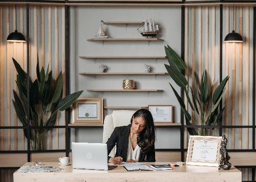
Here’s another example of a simple, professional “set”. A few diplomas to prove expertise, but not overdone. A few things of interest, but not enough to be distracting. One slight nit to pick in this image is lighting. The subject in this case will appear a bit dull and without having glasses, might benefit from a ring light.
But when you look at what the laptop camera is going to see? Pretty good!
We can help with set design. Some options you can also use; Find an interior designer or local real estate “stager” that understand simple, positive space design. Remind them, you’re going for “your brand”, your colors, etc. Test the scene on your preferred platform such as Zoom, Webinar Jam, Webex, GotoMeeting, etc. See how the lighting works. The more “natural” you can get it, better. The less “tech driven”, better.
The minute that set lighting is considered, (the ability to create attractive depth or shadows, a well-lit face and so on, might not be in your stager’s arsenal. Reach out! We’ll help!
What about color & style?
We can help with that too. We have a team member that specializes in helping you choose colors (set and clothing) that will compliment your brand! Our specialist is also really good a choosing great outfits that will help you shine!

One Last “No-NO”!

This comes from the archives of “how much can we find wrong in one photo?”
Horrible lighting, looking down at the cameras, but the worst?
PLEASE do not attempt to present your virtual meeting, zoom conference, webinar or other summit on a tablet, laptop, or (shudder) a cell phone that is being “hand-held”!
You’d be stunned at how many micro movements you make, and every breath you take, every move you make, will hit the camera and cause jitters. The amount of movement will make someone in your session sea-sick! It’s bad enough that you attend a session like this, but if you’re the presenter? Please don’t! Your audience thanks you!!


